I feel that my media product uses forms and conventions of real media products very well. For example, whilst looking at various other charity websites (homeless mainly) I used aspects of their layouts in my own website. If you take a look at www.crisis.org.uk/index.php their navigation bar is very similar to mine, I chose to use this in my own media product as it was very easy to use and looked very professional, therefore giving all of my pages a distinct look. Also, if you look back over their overall layout and compare it to mine, there are other similarities. The use of a ‘big image’ as the focal point of the homepage and the side panel with different links are some of the more obvious.
^^ CRISIS^^
Other forms and conventions used include: a weekly newsletter, facts and figures and social networking links. In the modern-era, social networking has become a very important media tool; every charity website has links to various social networks, mainly: Facebook and Twitter. These social networks have become conventions of charity websites; therefore I had to add a few into my own.
^^ FACEBOOK or TWITTER? ^^
Another website I closely looked at was http://england.shelter.org.uk/ . While I was browsing through I came across a convention which you see in most charity websites and used in my own - a free advice telephone helpline. I also came across an option to find help in your local area, therefore I inserted an option into my website were you could find help from my charity in different regions of the country. While I did find a lot of inspiration from looking at other charities, I didn’t want to copy and use so much from these real media products, which is why I tried to develop them further.

^^ Screenshot of Shelter.org ^^
Referring back to the layout, I could test Sklar’s theory on how people scan web pages and the importance of how a web page is laid out. Looking back on the real websites, all of their logos were located in the top left corner of the page and the most important information being located in the centre. I would adopt Sklar’s theory into my own website; however the theory gave me the impression of being based around the fact that the website had a lot of text. Seeing as my website was not very text heavy in some pages, I developed the layout of my pages differently to maximise the chances of the content in being consumed.
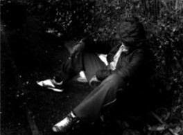
My media product not only used and developed forms and conventions, it also challenged them. If you look back on the websites I researched, most of them use ‘happy’ images which reflect the good work the charities do. However, I wanted the purpose of my product to show the effects and negative side of homelessness, which is why I decided to use grey, sad images throughout. I think these images would have a greater effect on an audience rather than the happier images usually used.
^^ Examples of 'sad' images ^^
Another way that my media product challenges the conventions is the colour scheme. It may seem like an obvious choice for charities to use darker colours in their websites, but brighter colours seem to be more popular. I decided for my product I would use a mix of darker and bright colours – blue, grey, black and white. Blue and grey were the main colours I used, and the mixture of the colours complimented each other very well. By using darker colours such as grey, I was able to set a tone for my website of being for a charity and serious, while the use of blue would give my website more colour and brightened it up.


No comments:
Post a Comment