Tuesday, 28 December 2010

MAIN TASK 8 & 9

14/12/10 - 16/12/10

FINAL DESIGNING OF 2010

In the last week before we break up for Christmas I went back to designing and added my pictures and more content to my website.
I decided that I wanted my pictures a bit more darker, therefore I used Adobe Photoshop to edit them further. I ran into a few problems with computers as some of the previous work I done had suddenly disappeared, fortunately I was able to fix it.


At this stage I've done most of the bulk of my website, my homepage almost looks complete and my other three pages are shaping up well. It won't be too long before I can say that I've completed my website. HAPPY NEW YEAR!


Not my job, but you get the point.

MAIN IMAGE

MAIN IMAGE
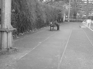
I thought my main image deserved to have it's own post as I am quite proud of it. I asked my 'homeless' friend to pose standing alone to symbolise him being alone.


Look and be impressed.

MAIN TASK - LESSON 6 & 7

09/12/10 - 13/12/10


PHOTOGRAPHS
Over the past few days/lessons I've begun to take the pictures I need for my website, a website would look incomplete without any. Seeing as my charities cause is homelessness, I took pictures of 'homeless-looking' people. All the pictures I've taken have been in black and grey.


Take a look:


Note: The pictures have been edited to be more darker than this as you may see on the website.

Tuesday, 7 December 2010

MAIN TASK - LESSON 5

07/12/10

DESIGNING!
Over the week I've begun to write up a draft of my content/information I want on my website. For the about us page, the content had to be related to the charity: what's the charty about, what do they do, etc...
Here's the draft mission statement:

"Our mission is to change people's lives for the better, by providing the much needed help and support the they can rebuild the stability in their lives."

Designing

MAIN TASK - LESSON 3 & 4

02/12/10 - 06/12/10

DESIGNING!
For the past few lessons I've been continuing on with the designing. Finally the website has started to take shape, I've created my logo, a colour scheme, completed all the navigation and most of the layout of my website pages.

The four web pages I will be designing for my charity website are:

- Home Page
- About us
- Homelessness
- Donate
Each page will look similar as most professional charity websites have conistency within their sites, however some features will obviously look different as each pages content is different.

Also, I've 'added' online links to my website such as: Facebook, Youtube and Twitter. A convention of all the charity websites I looked at had additional networking/online links.

Tuesday, 30 November 2010

MAIN TASK - LESSON 2

30/11/10

So after careful deliberation I've decided on naming my charity... FOUR WALLS
The idea behind the name has a lot to do with the cause, seeing as my charity is in support of homeless people I wanted my charities name to reflect that. When you think of a home you usually draw a picture in your head of a house with four walls and a roof, there's were my inspiration came from.

Also today, while continuing the designing I've created the 'base' of my charity with a navigation bar and a 'quick links' side menu. Here's the logo I've created for my charity with my new found name...

Quite impressive I must say!

MAIN TASK - LESSON 1

29/11/10


Today I started the actual designing of my charity website. Like the prelimenary task, we'll be using the dreamweaver software to design the website, luckily I still have my dreamweaver handbook.


Unlike the prelimenary task, everything in the main task has to be our own work and ORIGINAL. While creating a website for a school we were already given the name, logo, colour scheme, etc...
So the first issues I had to deal with when starting the whole design process, wasn't anything to do with designing. I've had to think of the colour scheme I want to use and the type of logo I want and most importantly, the name of my charity!


Here are a few homeless charity names I've come up with: (try guess the trend)
  • Rooftops
  • Four Walls
  • One Place
  • A Place
  • Help The Homeless
  • Home Sweet Home


THINKING?

SKETCHES & DESIGNS

Here are some of the sketches and designs I've drawn up to form the basis of my charity websites and its pages. You can clearly see that I've only gone in to small detail as I want to use these sketches as templates to help me through the process, my website will likely differ from the sketches. Take a look:


HOME


DONATIONS PAGE

ABOUT US
HOMELESSNESS

Tuesday, 23 November 2010

RESEARCH & PLANNING

For the past week I've finished looking and researching into my specific cause, homelessness.
Now that I've completed the research, I have begun planning how my website will look with a few rough sketches and designs. I'm currently still in the early stages of my planning and my plans are very likely to change throughout the whole process.


WORKING HARD.

Monday, 15 November 2010

CHARITY RESEARCH

CRISIS:

WHAT'S THE CHARITY ABOUT?

Crisis is a homeless charity, they aim to end homelessness by changing the lives of homeless people and educating by giving advice and information to prevent homelessness. Crisis could be labelled as a typical charity that most people are use to, they raise money through donations and fundraising and use the money to help the less fortunate. However, they also help by advising people and informing people in these difficult situations. The charity does a lot of work and this is obvious through their website.


CHARITY RESEARCH

15/11/10

Today I started more research, this time into my specific charities cause, homelessness.

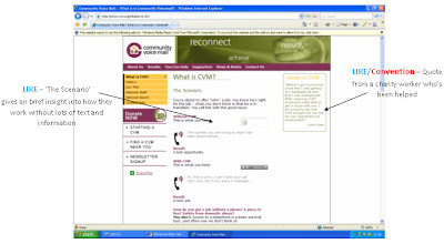
COMMUNITY VOICEMAIL:

WHAT’S THE CHARITY ABOUT?
Community Voicemail is not a typical homeless charity, they focus on helping people reconnect. There main aim is to give less fortunate people a direct link to gaining opportunities such as jobs and housing information as they may not always be able to get to a phone. Many charities focus more on raising money and helping people in a different way, CVM give people a chance to rebuild their lives themselves.


RESEARCH - MY CHARITY?

11/11/10

Now that my initial research for my main task is completed, I have to decide on what I want my charity to be about.

After looking back on my research and thinking about the resources I have available to me, I've decided to create a website about... HOMELESSNESS.


Monday, 8 November 2010

MAIN TASK RESEARCH

08/11/10

- In today's lesson I looked into more charity websites. I wanted to look at charities related to crime as I wanted a more broad insight into different causes and charities. Here's a website I looked closely at:

CHILD VICTIMS OF CRIME - www.cvoc.org.uk/


Thursday, 4 November 2010

MAIN TASK RESEARCH

CANCER RESEARCH UK - www.cancerresearchuk.org/

MAIN TASK RESEARCH

04/11/10

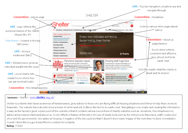
- In todays lesson I finished my research task of annalysing two charity websites and identifying the conventions and what I liked and disliked about them.

SHELTER - www.shelter.org.uk/

- I looked at this charity as it's cause is homelessness. It raises awareness and gives advice to those in need.
Check the screen shots out to look closer at my research.

Wednesday, 3 November 2010

RESEARCH - CONVENTIONS?

02/11/10

WHAT'S A CONVENTION?
- A convention is a set of agreed, stipulated or generally accepted standards, norms, social norms or criteria, often taking the form of a custom.  Don't understand?

Conventions are specific aspects which are always found in certain texts.
Examples:
  • Horror film - blood, death, victims
  • Newspapers - headlines, articles, images
  • Story - beginning, middle, end
It's important for me when designing my charity website to be aware of the conventions that a charity website should have, otherwise it could effect the end result of my website.

So what are the conventions of a CHARITY WEBSITE?
  • Donations
  • About us/mission statement
  • Information about the cause
  • Why people should get involved
  • Victims case studies
  • Images of the good work
  • Voulenteers comments
Look out for the conventions in my website!

Monday, 1 November 2010

MAIN TASK RESEARCH

Lesson 18 - 01/11/10

-  New term, new task. In todays lesson we began our research of our main task - creating a charity website.

- Similar to my prelimenary task research I'm goin to research various charities and their websites. As I have to create my own charity for a certain cause, I'm going to look at a broad range of charities for different causes.

Specific causues im looking to research include:
-    Drugs
-    Homelessness
-    Crime
-    Alcohol related
-    Medical (STD's, Cancer, etc..)


Not all about the money, helps though.

LESSON 17

21/10/10

So I've finished my prelimenary task, what to do next? Audience feedback.
Asked my whole class to go around and look at my site and comment on what they liked and didnt like. Here's some of the responses I got back:

"Clear and simple layout - it's really easy to read and navigate through"

"LOVE the media page ideas!"

"Good and consistant colour scheme"

"Really nice ideas and features - appeal to the tareget audience"


 "Media page looks great - slightly over-crowded"

"Home page looks a bit plain, needs a bit more colour"

"Needs more information"


Agree with most of the comments, I'll try and incoporate the feedback into my main task.


Thursday, 21 October 2010

LESSON 16

19/10/10

FINISHED!
I have finally finished my prelimenary task. Take a look.

Home page:


Media page:


PRETTY GOOD.

Tuesday, 19 October 2010

LESSON 15

Lesson 15 – 18/10/10
Done? Ask me next lesson. Keep watching this space!

The Waiting Game.

LESSON 14

Lesson 14 – 14/10/10
- Still working on the prelimenary. Practise makes perfect!

LESSON 13

Lesson 13 – 12/10/10
- In this lesson I began to add the final tweeks to both my home and media pages.
I decided that I needed something significant to complete my media page. A quote by Malcolm X should do the trick. Watch this space!
"The media's the most powerful entity on earth. They have the power to make the innocent guilty and to make the guilty innocent, and that's power." - Malcolm X

Mr. X

Monday, 18 October 2010

LESSON 12

Lesson 12 – 11/10/10
-          Media page continued
-          I began to think of the different kinds of media people are exposed to on a regular bases and I wanted to show these media texts in my media page.
Media texts:
Television:
-          BBC
-          SKY
-          ITV
Internet:
-          You tube
Social networking/phones:
-          Facebook
-          Twitter
-          Apple/iPhone
-          Blackberry                                                              LOOKING GOOD!
Newspapers:                                      
-          The Sun
-          Daily Star

LESSON 11

Lesson 11 – 07/10/10
-          Design process continued
-          Captured the images I wanted to use for my website. These included:
·         Image of entrance of the school
·         Students working
·         A ‘happy girl’ – exam results
·         The school environment
·         Teachers working

MAYBE I SHOUL'VE TOOK PHOTOGRAPHY!


DON'T THINK ALL THESE ARE GOING TO MAKE IT.

LESSON 10

WEEK 4 – commencing 04/10/10
Lesson 10 – 04/10/10
-          Design process continued
-          Began on my media page
I wanted the media page to look similar to the home page; therefore I used the same layout as I did with the home page. The navigation bar and logo were located in the same place.
-          Also, as like other professional websites the colour scheme is used throughout the whole website; therefore the same white, purple, and black colour scheme was used.


WORKING PROJECT.

Saturday, 16 October 2010

LESSON 9

Lesson 9 – 30/0910
-          Design process continued
-          Whilst designing I began to add the features that inspired me into my page:
 (refer to inspiration page)
 Latest News
Ø  I wanted to add this because it would give a reader an insight into events currently happening in the school, which would help them gain more information about the school
 Upcoming Events/Calendar
Ø  Similar to the ‘Latest News’, this feature would give readers more information about events upcoming in the school
 La Swap 6th portal
Ø  This portal feature is similar to a link; however it directs students/readers to the La Swap website. This is mainly for practical use, but does reflect the other form of education the school offers
 Video player/ virtual tour
Ø  This is a feature not every website has, however it is a very useful tool for a person who has never visited the school.


LOOKING GOOD RIGHT? STILL WORKING ON IT.

LESSON 8


Lesson 8 – 28/09/10
-          Design process continued
-          As the website was my own original work I had to create new information and content. Referring back to Sklar’s theory, I typed up my own ‘welcome paragraph – by the head teacher’ and placed it in the centre of the page.
-          I also began to use my inspiration page to look at the different features of other school websites that I wanted to implement into my own.
(e.g. Video player/virtual tour, calendar, ‘Latest News’, ‘Upcoming Events’, portals)


STILL UNDER CONSTRUCTION!

LESSON 7

WEEK 3 – commencing 27/09/10
Lesson 7 – 27/09/10
-          Began the design process.
-          With a tutorial booklet, I began to use the Dreamweaver MX software on which we would be using to design our websites.
-          After ‘learning the ropes’ of the software I began to design my navigation bar by referring back to my sketch/design.


THE MAGIC HANDBOOK!


LESSON 6

Lesson 6 – 23/09/10
-          After completing my research task of analysing other school websites, I began to sketch a design of what I wanted my web page to look like by referring to Sklar’s theory and looking at the current Parliament Hill website.
-          Key decisions I made about my layout (in reference to Sklar)
·         School logo would be located in the top left corner of the page
·         Menu/navigation would be located in ‘area 2’ (refer to Sklar’s model)
·         The most important content would be in the centre (area 1)
·         I would not use area 3 or 4
·         ‘Area 5’ would move to area 3 to efficiently use space

-          Other decisions:
·         Colour scheme:
Ø  White and purple – because I want to reflect the schools existing school colours as this is only a new design of the current website
Ø  Black text – as the text would be more legible
o   Font: The font Verdana would be used throughout most of the pages as it looks more professional. Also, fonts such as Times New Roman are outdated and can be very dull to read.
·         Images:
Ø  The existing head teacher’s image would be used as it would be time consuming for everyone to take their own picture
Ø  Image of school entrance/building to show how the school looks so that a viewer can identify the school
Ø  Students working in media lesson, giving a viewer a small insight into lessons at the school
Ø  Students posing with exam results showing achievement in the school

INSPIRATION PAGE

During the research task we had to create an inspiration page – ideas that we liked from other school websites and wanted to implement in our own web designs.Take a look!